Introducing Arc Browser and Why We Have to Switch?
For as long as I can recall, my online journey spanned across a plethora of web browsers, each boasting unique features; some advocating for digital privacy, others asserting independence from tech giants, and a few that focused on aesthetic appeal. Yet, a persistent issue remained untouched: managing a sea of tabs.
The roots of this problem stem from the age-old design of browsers which, surprisingly, have retained most of their foundational design elements from yesteryears. For instance, the early 2000s Netscape wouldn't feel entirely foreign to a user today. But in the present day, we practically reside within our browsers, constantly opening new tabs for entertainment, work, or leisure.
Enter Arc, my browser of choice for the past year, a revolutionary leap in how we perceive and use browsers. Here’s my experience:
A Glimpse into Arc Browser's Offerings
The modern-day internet user's needs have far surpassed what the likes of Google Chrome or Safari can offer, especially given their classic, yet increasingly restrictive design frameworks. The hunt for specific tabs becomes a game of “needle in a haystack” as they reduce to minuscule icons, and attempting to multitask feels like a jigsaw puzzle.
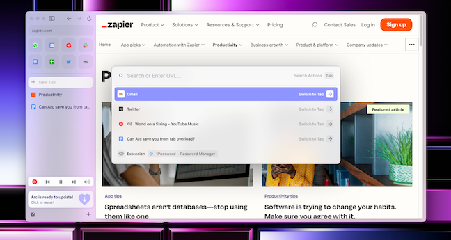
Arc is breaking these chains. Presenting itself as an "internet computer", Arc reimagines the core of browsing. It’s crafted more like an operating system: featuring a dynamic search function, a quick-access dock for favorites, multitasking with split-screen for tabs, dedicated workspaces, and so much more. It even proactively manages tabs by archiving unused ones and completely reinvents the navigation experience.
Making the Switch: My Arc Experience
At first glance, Arc might overwhelm, but gradually it begins to feel intuitive. A standout feature is its optimization of screen real estate. The URL bar, for example, has been discreetly placed, and sites I visit regularly aren't shoved into a corner but highlighted for quick access. Essential notifications, like unread mails, are also just a hover away.
Tabs Reinvented with Arc
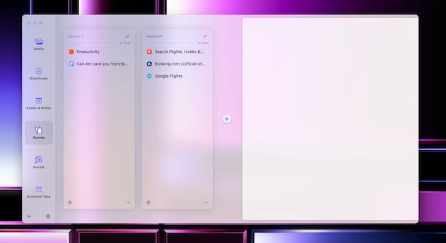
Arc introduces a sidebar for tabs, segmented into favorites, bookmarks, and temporary tabs. But the real game-changer is “Spaces”, akin to desktop workspaces. You can categorize tabs into different spaces, allowing for unparalleled organization. Also, given its Chromium base, it’s friendly with all Chrome extensions.
Multitasking Made Effortless
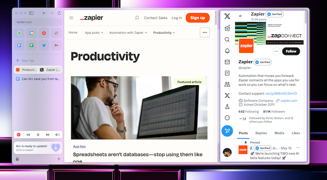
While Arc’s search function streamlines tab searching, multitasking feels revolutionary. Split views, saving tab configurations, quick media controls, and pop-out video feeds all enhance the browsing journey, despite the occasional minor search delay.
An Elegant Design Interface
Arc's design language is a harmony of sophistication and simplicity. The adaptability of the themes, coupled with intuitive color coding, ensures your workspaces look organized and aesthetic.
Compatibility Concerns
My only significant grouse is Arc’s confinement to the Mac ecosystem, which hinders seamless syncing with my myriad devices. However, a Windows iteration is reportedly on the horizon.
Should You Jump Ship to Arc?
Arc seamlessly melds with my online habits. However, it might not cater to everyone, especially if you're not submerged in the browser all day. But if you're grappling with tab chaos, Arc could be your silver bullet.


